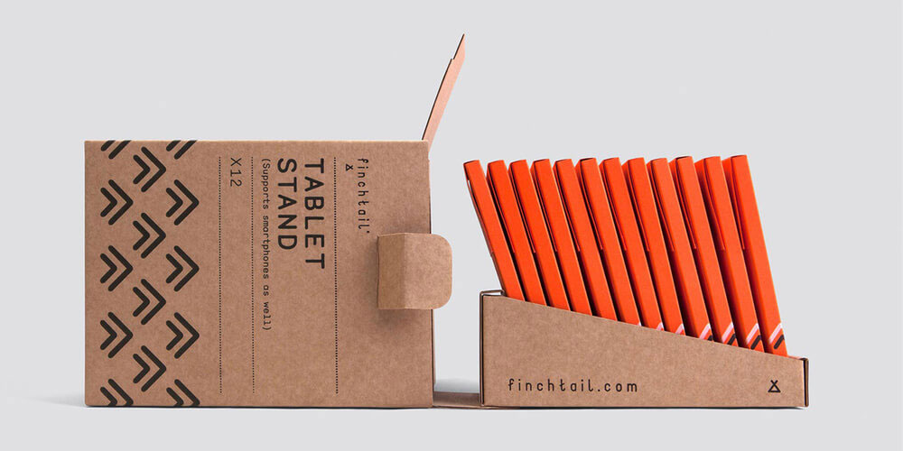
Finchtail is a new company focused on creating simple and useful products that are sustainably made. Their first product is an inexpensive cardboard tablet stand, and we developed their new identity, packaging and launch materials.
Initially we worked to define the brand strategy, based around the company’s desire to solve everyday problems with simple products that work well. The strapline (simple useful) things was adopted, along with a commitment to using fewer resources and better design.
With so much of the value in the design as opposed to the materials, it was important that the brand could support that value and tell the wider Finchtail story. Every aspect of the brand experience reflects and reinforces the strategy.
JUST LIKE THE PRODUCTS THEMSELVES, EVERYTHING IS SIMPLE, CRAFTED AND PUROSEFUL.
Just like the products themselves, everything is simple, crafted and purposeful.
The language is helpful and informative, and never loses its sense of humanity. The aesthetic is deliberately utilitarian, but with elements used throughout that add a degree of personality and emotion.
The product and packaging are printed using only black and white inks, with a vivid orange stock used for the outer packaging. This plays beautifully with the neutrality of the kraft board, while creating a handy wallet for the stand to live in after purchase.
Initial business wins for the product have been encouraging. The Design Museum trialled it in their shop and promptly sold out of the initial order within a few days. En Route, a global travel firm recently featured Finchtail as one of its exciting new products at major travel trade exhibition in Hamburg.
The product is available to buy direct from the website – finchtail.com
